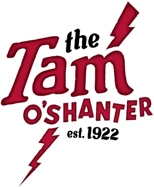
 Tam O’Shanter, a member of the Lawry’s family of restaurants and one of the oldest restaurants in Los Angeles, has redesigned its logo, menu, and uniforms. The new design aesthetic pays homage to the Tam’s legendary Scottish roots while retaining the sense of fun and whimsy that are hallmarks of the venerable restaurant.
The new logo features a lightning bolt, an allusion to a line in Scottish poet Robert Burns’ 1791 poem “Tam O’Shanter”, after which the restaurant is named. The lightning bolt, first seen in the Tam’s towering neon sign of the 1930s and 40s, has been reintroduced as a symbol of the new energy at the popular Atwater Village eatery and bar.
The menu design, which has changed several times over the Tam’s long history, now contains playful, Scottish influenced language and humor and brings back a colorful character from the restaurant’s past, Mr. McTavish.
New server uniforms have a more informal, contemporary look. Updates of classic elements – tams (or caps), tartan vests and denim kilts – honor the Scottish theme while conveying a renewed sense of spirit and fun.
In the lobby, guests will discover the “Wall O’Scotch” a display of over 102 single malts and blends from distilleries across the globe. They’ll also find new, comfortable seating in the lobby’s traditional corner Snug.
Posted by Lauren Harrity 12/10/13


